There are many choices when it comes to building a website or blog, catering to every level of technical knowledge. It can be overwhelming, especially because once you’ve chosen one, you probably won’t want to migrate to another one in the near future.
This post compares two of the heavyweights: WordPress and Jekyll.
Both are open source and very capable platforms, but with significant usability differences. WordPress is a content management system (CMS) that creates dynamic websites, with tens of thousands of plug-ins that expand the functionality of the site. Jekyll is a static site generator, so you build sites by generating static files (such as HTML) with your computer’s command line, and as such, there isn’t a database.
While WordPress’s popularity isn’t likely to go away anytime soon, its position as an all-around system means there are instances where it offers more than you need. Like having a full toolbox when you just need a screwdriver. Jekyll, and other lightweight alternatives, offer a stripped-back experience that aims to provide only what you need, and no more.
This piece will compare WordPress and Jekyll on the following:
– Main features
– Security
– Speed
– Stability
– Flexibility
– Design
– Support
Main Features
The main difference between the two platforms is that WordPress is a CMS that builds dynamic sites, and Jekyll is a static-site generator reliant on command line-generated files.
Both can create simple blogs or full websites, with navigation and multimedia. As it lacks dynamic features, Jekyll can’t provide tailored recommendations or user comments.
Both platforms are also free and open-source, although there are various ways to spend money with WordPress. A self-hosted site will have hosting fees, which can vary widely, and you may choose to buy premium WordPress themes and plug-ins to get your site looking and working exactly as you want. Jekyll can be hosted for free on the GitHub servers.
One major difference between WordPress and Jekyll is who they appeal to. Jekyll is likely to be more appealing to the person with some coding knowledge who is happy to spend time on the command line. WordPress, by contrast, has a graphical user interface and a database, and it’s beginner-friendly once you’re past the initial learning curve that any new platform has.
Security
You may have heard horror stories about how WordPress sites get hacked or targeted by cyberattacks, which can give the impression that WordPress itself isn’t secure.
The good news is that this isn’t true. WordPress Core is run by a highly skillful team who release regular updates to fix any vulnerabilities and security threats. Just keeping your WordPress site updated will go a long way toward staying safe and secure.
WordPress also allows you to install a wide range of themes and plug-ins, tweaking every aspect of design and functionality. Unfortunately, these are not all equal. As they’re created by third-parties, there’s variety in how stable and secure they are. It’s a good idea to stick to reputable names and the official WordPress directories.
To further increase peace of mind, you can add security plug-ins such as Wordfence that regularly scan for malware.
The standard rules of online security come into play here: Use strong passwords, choose a secure hosting provider, and keep WordPress, plug-ins, and themes up to date.
As a static site generator, Jekyll doesn’t need regular updates. Unlike WordPress, there’s simply nothing for a hacker to exploit. Because Jekyll’s files are stored locally, your main risk is if someone gains access to your computer.
You can also store backups of the files in a cloud-based storage solution such as Dropbox, Google Drive, or iCloud. The static files take up trivial amounts of space, and if ever your site is compromised, you can simply download the files from the cloud and put them back on the server to regenerate your site.
Speed
While it’s not like comparing a Formula One car to a bicycle, this one isn’t exactly a fair fight. For all the speed optimizations WordPress offers, Jekyll loads static sites, which are fast.
That’s not to say WordPress is slow, however. It can also be very fast, particularly with a good hosting provider and a well-chosen speed plug-in. The size of your site will also play a part; loading a simple, small blog is different from loading a huge landing page with lots of images, videos, and other resource-heavy elements.
Nonetheless, there’s no getting away from the fact that WordPress is a dynamic site builder that loads from a database. Jekyll loads very small static files, and it can be sped up even further by using plug-ins such as ImageOptim API.
Stability
WordPress and Jekyll are both secure platforms. As already noted, WordPress Core is managed by a skillful and dedicated team, so new updates are regular and impactful.
One area where WordPress’s stability can be called into question is when there’s a significant spike in traffic. On a dynamic site, the content has to be processed, and queries are sent to the database on the server. Higher traffic means more and more demands on the server, which can result in extremely slow rendering times or the site crashing entirely. This doesn’t damage the site, but it can be a frustrating user experience.
Another point of consideration is that individual plug-ins can stop working properly on WordPress. This can sometimes affect the entire site, or it can cause specific components to stop working, such as widgets not loading correctly.
Static-site generators like Jekyll don’t have the problem caused by traffic spikes, because each page is pre-rendered, and the per-visitor demands on the server are much lower.
Flexibility
It could be argued that if you looked up “flexibility” in the dictionary, there should be a picture of the WordPress logo next to it. Remember Apple TV commercials for the iPhone’s App Store, the ones that said “There’s an app for that”? Well, it’s a similar story with WordPress—whatever you want to do, there’s probably a plug-in for it, from Google Analytics to Facebook Pixel.
You don’t necessarily have to rely on those plug-ins. If you’re comfortable with code, you can edit the CSS directly or add custom code without touching the main CSS file. Some companies, such as Thrive Themes, even let you create your own theme in a completely no-code environment. If that’s still more hands-on than you’d like, you can simply install one of the many, many thousands of free or premium themes available. And there are the very popular page builders, giving additional flexibility to individual pages without having to create your own theme. Elementor, Themify, and Thrive Themes are a few popular examples.
This flexibility also means WordPress can be almost anything you want it to be. Simple blog? Yes. Landing page with opt-in form? Absolutely. Membership plug-in with gated content? Easy. Forum? Not a problem. E-commerce website for selling digital or physical goods? Of course.
Jekyll is no slouch in the flexibility department either. Users with little or no coding experience will find it difficult, but experienced developers will be able to do almost anything through the code, from shifting the logo by a single pixel to nailing the overall design.
As a static site generator, Jekyll has limitations compared to WordPress. It’s not possible to create a forum on Jekyll directly, for instance, and although you could include e-commerce solutions, they’re suitable only for smaller projects.
Jekyll has a library of themes and plug-ins to choose from, but not nearly as many as WordPress offers.
Design
In many ways, this section will be largely influenced by your preference. Both WordPress and Jekyll sites can build beautiful sites in almost any design you want.
Some people will find it an advantage that WordPress has a graphical user interface and CMS, while others will prefer Jekyll’s command line interface.
Both display multimedia, although WordPress allows you to do some basic image editing on the platform, whereas Jekyll doesn’t. This might be a slight advantage for some.
There are a lot of themes and plug-ins available for both platforms, too, giving you a quicker way of getting the design you want without building it from scratch. WordPress does have a far bigger library of both, though, so the design edge may have to go to the CMS here.
Support
Jekyll has multiple support options: official documentation, discussions on the Jekyll Forum and StackOverflow, as well as a Gitter channel and IRC channel on Freenode. Aside from the documentation, the support is dependent on the community, which is an active one.
WordPress also has documentation, as well as official community forums. For sites hosted by WordPress, there is the option to talk to customer support on the phone. Because of its popularity, there are a lot of options for WordPress support, from hosting platforms to independent technical support companies.
Conclusion
WordPress and Jekyll are both mature and highly capable platforms. There are broad similarities between the two, but there’s enough of a difference in usability and features that picking the right one for you is likely to be a fairly easy decision to make.
If you’re not experienced with code, want a CMS or graphical user interface, or want access to all of the themes and official plug-ins, WordPress is probably going to be your preference. You’ll need to stay on top of updates to keep the site secure, and you may also want to consider paying for monthly tech support to ensure everything—including plug-ins—stays up to date and to benefit from security and malware scans and from better hosting to prevent downtime from traffic spikes.
On the other hand, if your ultimate preference is speed or security—and you’re comfortable with code and community support—Jekyll might be the way to go. The fact that it’s low-cost or free is persuasive, too.
In this article, I’ll be showing you how to create a custom error 404 page in GitHub Pages, a static site hosting service that allows you to publish and host your web pages through GitHub.
To break that down quickly: a static site is a website made up entirely of HTML, CSS, and JavaScript files. Everything the site needs to render is contained within these files, so there’s no need for server technology like PHP, Node.js, or Python. If the static site needs extra data from a server, it makes an asynchronous HTTP request with tools like fetch api or axios. And you’ll probably want to make sure that static site has a 404 page.
Displaying a 404 error page on your site is sort of like delivering bad news—the tone and manner of your delivery can determine if the person receiving the news will either be upset or be ready to agreeably look for another solution. After putting in all the hard work finding the best blogging platform, you don’t want a 404 to let you down.”Fortunately, GitHub Pages makes creating one a walk in the park.
How Does GitHub Pages Work?
Hosting your site on GitHub Pages is as easy as signing into GitHub and creating a new repository.
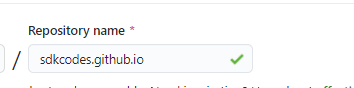
Your repo name should have the following format: <your github username>.github.io.
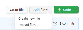
Add files to your repo. You can do this either by creating the files locally and pushing to remote or by creating the files directly on GitHub.
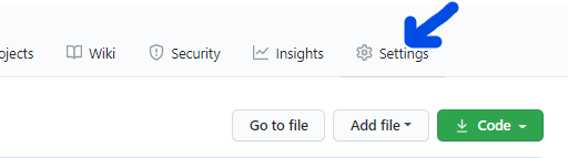
Go to the Settings tab of your newly created repository.
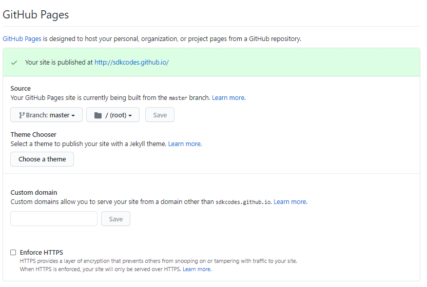
Scroll down to the GitHub Pages section.
Here, you can choose the branch you want to serve your pages from, the root directory, and even select a Jekyll theme. If you already have a custom domain name, you can add it here.
By adding a custom domain name, you can access your site using yourdomainname instead of your github.io domain.
That’s all! Your site is now ready to be published. Visit <your github username>.github.io to see your new website.
You can make changes to your site whenever you choose. They become available immediately after you push/merge to the branch you’ve chosen to serve your pages from.
Using GitHub Pages for your static site gives you some nice benefits:
GitHub Pages is free to use. No coughing up extra cash just to host some basic web pages.
You can use it to host websites like single-page applications or blogs.
You can add a custom domain name to your site.
You can enable HTTPS for your domain in just one click.
You get the added advantage of managing your site with Git. Version-controlling your website becomes a piece of cake.
Why Is a 404 Page Important?
The 404 page is a famously dreaded sight across the internet. It’s a page that neither website users nor owners like to see, but it’s an unavoidable one. Its purpose is to inform a user that the page they’re looking for doesn’t exist.
Think about it: it isn’t every time you go into a store that you find everything you’re looking for. Certain items may be sold out or perhaps the store never sold them to begin with. That’s exactly what happens on the web. Perhaps the page’s URL changed, breaking an old link, or maybe the page was removed altogether. A user could have manually input the wrong URL to begin with. However a user has arrived at a particular URL, the requested web page doesn’t exist.
Specifically, 404 is an HTTP status code for a “Resource Not Found” or simply “Not Found” error. It applies to all kinds of resources on the web, including HTML files, CSS files, JavaScript files, documents, images, and just about any other file that could be requested from a server.
How you as the webmaster choose to convey a 404 error is very important. It can either improve your user’s experience on your site or make it worse.
What Makes a Good 404 Page?
At the end of the day, what’s on your 404 page is up to you, but I can give you a few tips to make it as palatable as possible for your users:
First and foremost, a 404 page should return with an actual 404 HTTP status code. This is important so web crawlers like Google’s bot don’t incorrectly index an erroneous page as a valid page, as this can negatively impact your SEO.
The 404 page should make it clear to the user that there’s a problem. This can be achieved by making the 404 or Not Found message prominent on the page.
The page should offer a way out to the user. Unless you want the user stuck on your error page or want them to close your site immediately, your 404 page should provide them with a means to navigate away from the page. Add an obvious link to your site’s homepage to somewhere on the error page, or you can suggest links to pages that might be similar to what the user was looking for in the first place.
You can provide a way for users to report a broken page, enabling you to quickly fix any issues.
Add a search bar for users to find other things they might be looking for.
Make the design pleasing to the eye. A 404 page is still a part of your website, so you should put as much thought into its design as you have for other valid pages. The page should carry elements of your brand, and not look like a desert island.
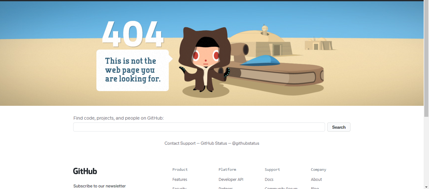
GitHub’s very own 404 page is a good example of what a 404 page should look like. The error code and message are both prominent on the page, and there’s a search bar to help you find other content.
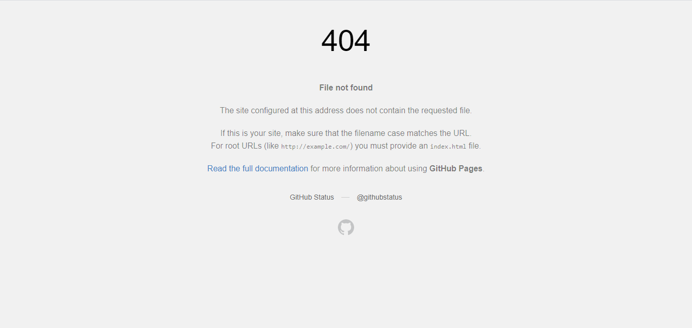
If you don’t add a custom 404 page to your GitHub Pages site, then by default GitHub displays the following 404 page:
Not bad, eh? But not good enough for your brand.
How to Create a Custom 404 Page in GitHub Pages
Fortunately, GitHub also understands the importance of a 404 error page, and provides developers an easy way to add one to their GitHub-hosted pages. Let’s look at how you can add your own custom 404 page.
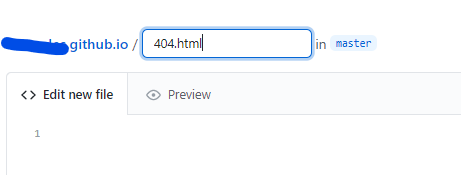
Create a new file in the root of your repository and name it 404.html.
Then go on to add content for the 404 page as follows:
Commit your changes, then try to visit a page that doesn’t exist on your site, eg,username.github.io/a-random-page-that-doesn't exist. A page like this should appear:
Conclusion
Hopefully, this article has shed some light on the importance of a 404 page and why you should put some effort into branding it as you would other pages of your website. When properly done, a 404 error page can be a good way to increase your website’s conversion rate.
Unlike many other host servers where you have to tinker with .htaccess or other kinds of configuration settings to handle 404 error pages, GitHub Pages makes it incredibly easy. All you need to do is add a single file, and you’re good to go.
Static site generators create HTML sites, with predictable page layouts and content with regular presentation such as blogs. There are many frameworks that can leverage a programming language and allow you to reuse code and process assets for these HTML pages, but this article will compare two of the most popular: Hugo and Jekyll. (For a comparison of a static site and a dynamic site, see Jekyll vs WordPress)
Why Use Static HTML Pages?
Static site generators are appealing because they produce secure sites requiring little maintenance that are faster to serve than dynamically generated web pages. With dynamic web pages, a web framework installed on a server generates the page a user sees. A user makes a request, the server queries a database, pulls out the information users want to see, combines that data into an HTML page, then sends that page to a user.
With static HTML pages, the pages are pre-rendered, so the server doesn’t do any of the work of building the page. It only handles sending the appropriate page to the user. This means that static HTML pages are faster, and the computing requirements for the server are much smaller; important in cloud environments where you’re charged for computing power.
Static pages cut out the page generation, so the user receives their page much more quickly. Security risks are also smaller because there are fewer moving parts for attackers to infiltrate and exploit. Static HTML pages are easily cached, so they’re well suited to be served from content delivery networks (CDNs), making response times even faster.
Because static pages don’t require servers to perform calculations or query the database, you can deploy them using very simple, low-cost hosting options like an Amazon S3 bucket or GitHub Pages.
Static Site Generators
You could simply write an HTML page and put it on a server, hearkening back to the early days of the web, but static site generators make it much easier to create new pages that use existing templates or modify all of your existing pages at once.
One of the first static site generators to restart this trend in web development was Jekyll. Hugo joined in five years later.
What is Hugo?
Hugo is a super fast, highly secure static site generator that positions themselves as a fun and modern website building tool. It is written in Go and sites can be hosted anywhere. One of the more standout features is that Hugo static sites don’t need a database on runtimes like Ruby, PHP or Python. According to their website, Hugo static site generator “is the fastest tool of its kind” listing average site builds speeds of under a second. \
More information on “What is Hugo”.
What is Jekyll?
Jekyll is an open source static site generator written in Ruby by the co-founder of Github, Tom Preston-Werner. It translates plain text documents into static sites that can be used for informational based websites or blogs. It has built-in support for Github pages and is one of the more popular static site generators available.\
More information on “What is Jekyll”
Hugo vs. Jekyll
With either generator, you can get a templated blog up and running in under thirty minutes. If you’re starting from nothing, Hugo is slightly easier to install. With Jekyll, you have to install a couple prerequisites like Ruby. Go comes as a precompiled binary bundled along with the Hugo installation.
For both Jekyll and Hugo frameworks, you’d normally write a content file like a blog post in HTML or Markdown. This content gets combined with HTML templates, which wrap and style the content, outputting an HTML file for display on the web.
Both frameworks allow developers to add variables to content, using the YAML markup language, and consume data files in common formats like JSON and CSV. Both frameworks also come with a number of features useful for a blog, like tags and the ability to route content files to finished HTML pages. They are also open source, so you can request changes and contributeimprovements.
The first and most fundamental difference between the Jekyll and Hugo frameworks is the language they’re written in. Jekyll is written in Ruby, a popular scripting language that was one of the first languages to come with an opinionated web framework, making it extremely popular for building websites quickly. Hugo is written in Go, which was developed at Google with an eye on concurrent execution, optimizing for deployment in cloud environments where computing power is distributed across many machines.
Each framework also has different preferences about what languages it works well with. Jekyll offers support for CoffeeScript and SASS/SCSS. Hugo supports TOML and JSON markdown in content files, but supporting SASS and SCSS might require some additional setup.
The Template Situation
One of the main benefits of the Jekyll framework is its ease of use, well-developed documentation, and broad support from major organizations like GitHub. Jekyll was released twelve years ago and helped kick off the new interest in static HTML sites. Hugo was released later and is less popular, so it has a less developed ecosystem of plug-ins and templates.
GitHub topics offers a whopping 1,200 themes to choose from for Jekyll, while there are only 370 options offered on the Hugo themes pages (although, you can also create your own themes). Obviously, it’s much more likely you’ll find a theme with the look you want with Jekyll. Jekyll is supported by GitHub, so if you want a simple, no-cost deployment, Jekyll works seamlessly with GitHub Pages, so you can have a simple Jekyll blog up and online very quickly by following GitHub’s excellent documentation.
Another difference between the Hugo and Jekyll frameworks is that creating a brand-new site with Jekyll by running the command jekyll new my-awesome-site installs a basic theme, while creating a new site with the hugo new site my-awesome-site command only generates the folder structure and an archetype file. With Jekyll, you’ll have something to work with right away, but with Hugo you’ll be looking at an empty screen waiting for you to add a theme or custom templates.
This can be great for a totally customized setup, but Jekyll has a much quicker path to seeing content you can work with.
Speed, More Speed
One of the major benefits of using the Hugo static site generator is its speed. Leveraging the focus on concurrency of the Go language means blogs with thousands of entries or tons of images will generate HTML more quickly. That matters if you’re running code anywhere you’re paying for computing power.
It also matters during development, because changes that you make to templates or content are re-rendered more quickly with Hugo. This speed difference is noticeable even at low page counts, but it becomes significant if you’re building a hundred pages of content.
Hugo Bonuses
Hugo offers support for internationalization, providing multiple ways to categorize content in different languages. Hugo also offers image processing, built-in menus, site mapping, and live reloading.
You can achieve the same result in Jekyll, but it’ll take more work to set up. In Jekyll, this functionality comes from plug-ins, but if you’re building complicated pages, it’s nice to have it built-in.
Hosting
Both languages offer options for easy hosting, but Jekyll is the simplest. Jekyll and GitHub Pages have a close, long relationship, and deploying a Jekyll project to GitHub Pages is simple and fast, which can be a great option for trying out a blog with Jekyll.
Hugo also offers many hosting options. For both generators, you have two fundamental options:
You can run the site generator locally, then upload the results to a server. You can do this manually or instruct some service to grab your updated HTML.
You can install the static site generator on a computer in the cloud, tell that computer to run the content generation command, then serve the files that process creates. This is how services like Amazon Amplify, CloudCannon, and Netlify all work. These providers all have specific guides for deploying sites, but the deployment process is pretty painless when using either static site generator.
What to Choose
Jekyll and Hugo are both well suited for blogs and other frontend-oriented sites. They generate static HTML pages by combining content written in a markdown language with HTML templates.
The Jekyll static site generator has the fastest setup, more options for templates, and offers an easier experience when getting started, but it can start to feel slow once you’re processing a hundred pages. Hugo’s initial setup is more complicated, but it can handle larger sites with more speed, for example a Hugo blog.
When deciding, think about the languages you’re familiar with, the types of markdown you want to use, and how you’ll deploy the site. If you want to start blogging right away, Jekyll is a great fit, but if you anticipate writing lots of content, the speed and features of Hugo will make your development experience smoother.
Gatsby Starters are boilerplates that you, as a developer, can use to set up a new site with preconfigured tools and plugins instantly. You can modify and build on top of the starters to speed up your development process.
You might ask, why create your own starter? Why not just use an existing starter? There are a few reasons developers invest the time building a starter:
To help other developers build a better site on Gatsby using unique features or designs.
To showcase it in the official Gatsby Starter Library and gain recognition for your work.
To promote your freelance services by creating a portfolio starter with your information. Every time someone uses your starter, they will see your portfolio.
{% raw %}
In this tutorial, you will use the Gatsby CLI tool to generate a Gatsby-powered site with minimal configurations quickly.
Run the following command in your terminal to create a Gatsby site with minimal configuration using Gatsby Hello World Starter.
gatsby new gatsby-starter-blog https://github.com/gatsbyjs/gatsby-starter-hello-world
cd gatsby-starter-blog
gatsby develop
You can read more about setting up your Gatsby development environment here.
gatsby-source-filesystem Plugin
The next step is to install the plugins you will use in this starter blog, the first of which is gatsby-source-filesystem. This plugin creates File nodes which point to the location of each file to the GraphQL query gets data from.
You can read more about sourcing from the file system here.
Run the following command in your project’s root directory.
npm install gatsby-source-filesystem
Now, update the gatsby-config.js file to use this plugin.
In the above code, you have three instances of the gatsby-source-filesystem plugin for pages, posts, and images folder. All the JavaScript files like index.js reside in the pages directory, posts folder is where your articles are stored. The images folder is for any images or image resource you might need in your blog like your profile picture.
Now, create the posts and images folders inside the src directory. Run the following commands in the terminal.
cd src
mkdir posts
mkdir images
cd ..
gatsby-plugin-google-fonts Plugin
I like using Google Fonts as a free improvement over most operating systems’ standard font options. To use Google Fonts in Gatsby, install the gatsby-plugin-google-fonts plugin.
npm install gatsby-plugin-google-fonts
Update gatsby-config.js to use the gatsby-plugin-google-fonts plugin.
Feel free to explore Google Fonts and import the fonts of your choice.
gatsby-plugin-sharp and gatsby-transformer-sharp Plugins
Optimizing images on your blog improves user experience by making response times faster. This in turn can help your blog’s ranking in search engines and makes your site more usable on mobile internet connections, so it’s important to optimize your images.
MDX is a variant of traditional markdown that lets you write JSX in your markdown files. With MDX you can style and customize your posts in the markdown file itself and can even load dynamic data in them.
This plugin will allow you to create pages with .mdx and .md extensions in src/posts and process any Gatsby nodes with Markdown media types into MDX content.
Update gatsby-config.js to include the gatsby-plugin-mdx, gatsby-plugin-sharp and gatsby-transformer-sharp plugins.
Styled Components is an amazing CSS-in-JS tool that lets you write CSS in your JavaScript files. This makes it easy to manage all your styling without having any CSS files in your project.
There are many other benefits and advantages of CSS-in-JS like managing dead code elimination becomes easier with it, styles are scoped to a specific component. It also makes it easier to write unit tests. Many CSS-in-JS libraries also have built-in support for animations, source maps and caching.
Run the following command in the terminal to install the gatsby-plugin-styled-components plugin.
Now create a global-styles.js file to add global styles and theme to the app. Global Styles as the name suggests are the styles that are scoped to the global level in your app. For example, if you define the font-size property as 3rem in global styles then the font size of all text will be changed to 3rem across your app.
A theme is an object or set of styles that you can define and access in your CSS-in-JS. For example, if you want to add dark mode to your app, you can define two nested objects in the theme object, one for light mode and another for dark mode. Each object will have properties like background color, font color, etc., and when the user clicks the dark mode button, it will toggle between the light and dark styles object.
In the above code, you created a theme object with some basic CSS and used the createGlobalStyle function from styled-components to add global styles to the app.
To use the theme and global styles, you need to create a file named gatsby-browser.js in the project’s root directory. Run the following command in your project’s root directory.
touch gatsby-browser.js
Add the following code to the gatsby-browser.js file.
// gatsby-browser.js
import React from "react";
import { GlobalStyles, theme } from "./src/themes/global-styles";
import { ThemeProvider } from "styled-components";

export const wrapRootElement = ({ element }) => (
  <ThemeProvider theme={theme}>
    <GlobalStyles />
    {element}
  </ThemeProvider>
);
Here you use the wrapRootElement function from gatsby to wrap the entire root element with ThemeProvider wrapper component from styled-components, which provides a theme to all React components underneath itself via the context API.
You pass the theme object created in the global-styles.js file to the theme prop of the ThemeProvider component.
Then you pass the GlobalStyles component at the top of the React tree.
You can access the theme object attributes as props in any of the component like ${props => props.theme.fontSizes.medium};.
Start your development server by running the gatsby develop command and head over to http://localhost:8000/.
You will notice that the background-color, font, etc., of the app, has changed according to the CSS in the GlobalStyles component.
Creating a Container Component
Your Starter should have consistent styling and a common layout throughout the different pages or it will seem messy and result in bad user experience. In this section, you will create a Container component that will wrap your entire app with a navbar and a footer. The Container component is the common layout of your starter and contains other components such as a Footer component and a Navbar component.
Although it’s not a requirement for a Gatsby Starter to have such a Container component, you will find that by splitting code into different components, it becomes easier to manage and helps remove repeated code. For example, every page in your starter will have a footer, so instead of repeating the same code, make and use a separate Footer component in its place.
In the src directory, create a file named Container.js inside a folder named components by running the following command.
cd src
mkdir components
cd components
touch Container.js
This Container component defines the layout of your app.
Update the pages/index.js file to include the Container component like this.
// index.js
import React from "react";
import { Container } from "../components/Container";
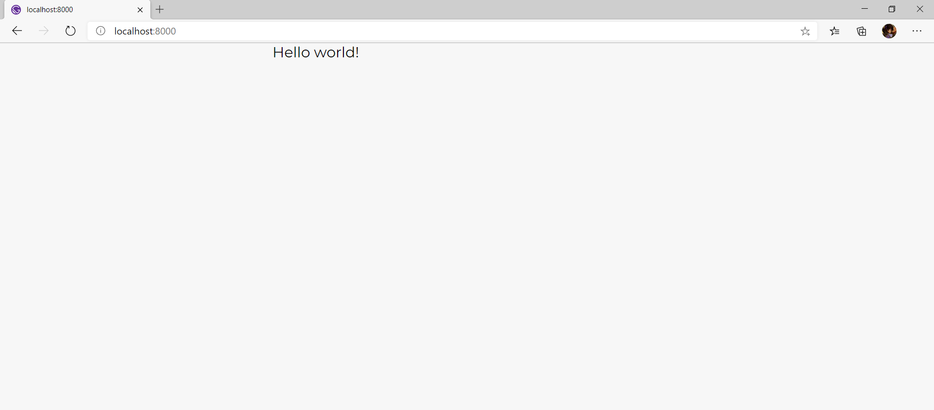
export default function Home() {
return <Container>Hello world!</Container>;
}
With your development server still running, navigate to http://localhost:8000/ to see your app with the new container.
Creating a Navbar Component
The next step is to create a navbar component and use it inside the Container component.
Run the following command inside the components directory to create the Nav.js file.
touch Nav.js
You will also need to install react-icons to add icons to your blog. This package includes some of the most popular icon libraries like Ant Design Icons, Bootstrap Icons, and more. Having different icons in your Starter can result in better user experience, and social media icons (Instagram, LinkedIn, Facebook) can help your readers connect with you on different platforms.
Install react-icons by running the following command.
npm install react-icons
Add the following code to Nav.js.
// Nav.js
import React from "react";
import { Link } from "gatsby";
import { FaRegMoon } from "react-icons/fa";
import styled from "styled-components";

const NavWrapper = styled.nav`
  font-size: 1.5rem;
  display: flex;
  justify-content: space-between;
  align-items: center;
  flex-direction: row;
  margin-top: 0.3rem 0.6rem;

  a {
    text-decoration: none;
    font-family: Satisfy;
    color: #6a5acd;
  }
  svg {
    font-size: 1rem;
    color: #4a4656;
    &:hover {
    color: #000;
    }
  }
  @media only screen and (max-width: 480px) {
    font-size: 1rem;
  }
`;
export const Nav = () => {
  return (
    <NavWrapper>
    {/* Replace with your Name */}
    <Link to="/">Ashutosh K Singh</Link>
    <FaRegMoon />
    </NavWrapper>
  );
};
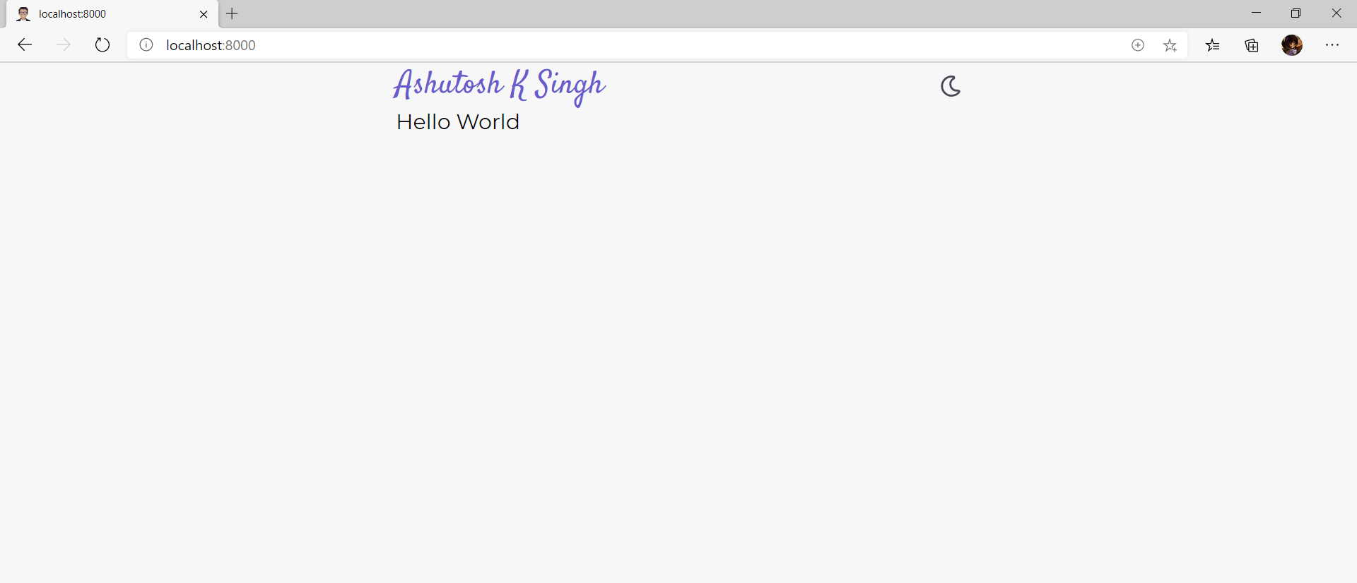
In the above code, you use the Link component to add a link to the homepage, i.e., to the / page. Make sure to replace the text inside the Link component with your name. You can also use a logo instead of text.
Update the Container.js file to include this component like this.
// Container.js
import React from "react"
import styled from "styled-components"
import { Nav } from "./Nav"

const ContainerWrapper = styled.div`
  height: 100%;
  display: block;
  margin: auto;
  max-width: 640px;
`
export const Container = ({ children }) => {
  return (
    <ContainerWrapper>
    {" "}
    <Nav />
    {children}
    </ContainerWrapper>
  )
}
Head over to http://localhost:8000/ to see your app with the new navbar component and icon.
Creating a Footer Component
The next step is to create a Footer.js file to add a footer to the Container component. Run the following command inside the components directory to create the Footer.js file.
The code above first imports all the different icons from react-icons and then creates an unordered list with all the icons. Inside the <li> tag, it uses <a>s to add different social links like Facebook, Instagram, etc.
One thing you may notice is the rssFeed, which points to http://localhost:8000/rss.xml. You can ignore this for now, but this is the route where you will create the RSS feed for your blog later in this tutorial.
Remember to replace the above links with your social handles and URLs.
Update the Container.js file to include this Footer component like this.
// Container.js
import React from "react";
import styled from "styled-components";
import { Nav } from "./Nav";
import { Footer } from "./Footer";

const ContainerWrapper = styled.div`
  height: 100%;
  display: block;
  margin: auto;
  max-width: 640px;
`;
export const Container = ({ children }) => {
  return (
    <ContainerWrapper>
    <Nav />
    {children}
    <Footer />
    </ContainerWrapper>
  );
};
In this section, you will create a Bio component with an image and some information about the author. Having a bio will help readers connect with you on a more personal level. You can tell them about yourself, why you write articles, and where they can find your other work. A good bio section helps build a sense of trust between content creators like bloggers and the readers.
In this section, I’ll refer to an image named myAvatar.png inside the src/images directory. You can either replace this with your avatar or download the image used in this tutorial from here.
As you may remember, you installed gatsby-plugin-sharp and gatsby-transformer-sharp plugins in the above sections to optimize your images. Now you need to install the gatsby-image component to make use of those plugins.
Run the following command in your project’s root directory to install gatsby-image.
npm install gatsby-image
Run the following command inside the components folder to create a Bio.js file.
touch Bio.js
Add the following code to Bio.js.
// Bio.js
import React from "react";
import styled from "styled-components";
import Img from "gatsby-image";
import { useStaticQuery, graphql } from "gatsby";
import { GiDove } from "react-icons/gi";
const BioWrapper = styled.div`
display: flex;
flex-direction: column;
align-items: center;
justify-content: center;
text-align: center;
margin-top: 0.4rem;
svg {
color: purple;
font-size: 2rem;
}
h2 {
margin-bottom: 0.5rem;
}
h3 {
margin: 0.8rem 0;
font-weight: 600;
}
`;
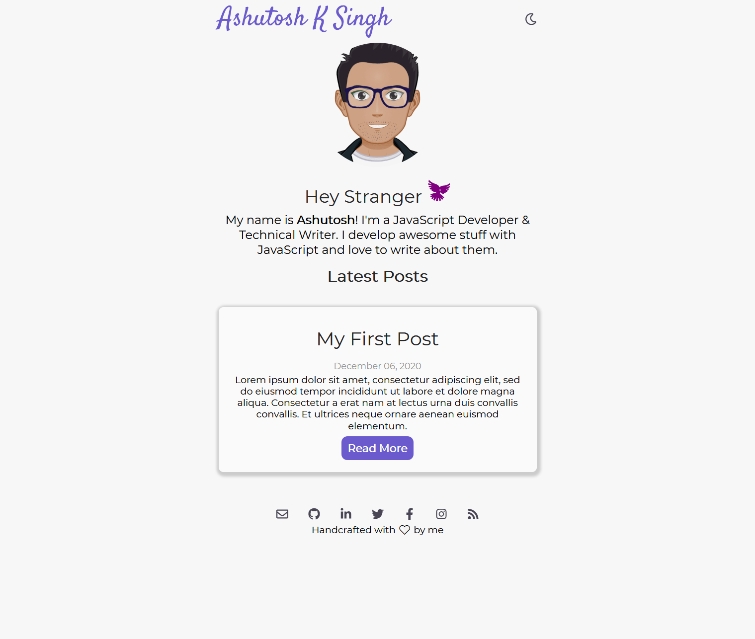
export const Bio = () => {
const data = useStaticQuery(graphql`
query {
imageSharp(fixed: { originalName: { eq: "myAvatar.png" } }) {
id
fixed(width: 250, height: 250) {
...GatsbyImageSharpFixed
}
}
}
`);
return (
<BioWrapper>
<Img
fixed={data.imageSharp.fixed}
style={{ borderRadius: "50%", left: "0", top: "0" }}
alt="My Avatar"
/>
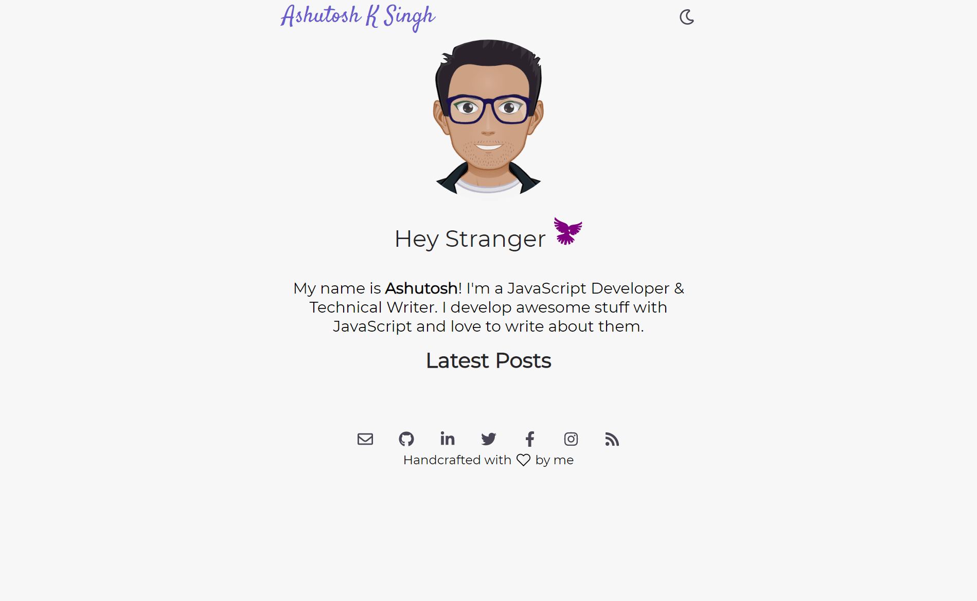
<h2>
Hey Stranger <GiDove />
</h2>
<br />
<p>
My name is <b>Ashutosh</b>! I'm a JavaScript Developer & Technical
Writer. I develop awesome stuff with JavaScript and love to write about
them.
</p>
<h3>Latest Posts</h3>
</BioWrapper>
);
};
In the above code, you added a Hey Stranger message and a short bio. Make sure to update these paragraphs with your information.
Take a look at how you are fetching the myAvatar.png image.
Here you are using the useStaticQuery hook and graphql imported from gatsby. useStaticQuery hook does not accept variables (hence the name “static”), and is used here to find with originalName: { eq: "myAvatar.png" }. Replace myAvatar.png with your image name. You can read more about ...GatsbyImageSharpFixedhere.
You then pass this data.imageSharp.fixed to the Img component from gatsby-image like this.
Update the pages/index.js file to include this Bio component.
// index.js
import React from "react";
import { Container } from "../components/Container";
import { Bio } from "../components/Bio";

export default function Home() {
  return (
    <Container>
    <Bio />
    </Container>
  );
}
Restart your development server and head over to http://localhost:8000/ to see the bio component on your blog’s home page:
Creating an SEO Component
SEO stands for Search Engine Optimization, it means that you are optimizing your website to rank better in the results on search engines like Google. There are many factors that affect your site rank on Google or other search engines like the web crawl accessibility, optimized keywords on each page, fast loading speeds, good user experience, and more.
Gatsby can help your site rank and perform better in search engines. Because Gatsby pages are server-rendered, the crawlers are easily able to access your site. You can also add meta information so the search engines can understand your content and know where to show your pages in search results. You can read more about SEO for Gatsby here.
In this section, you will create an SEO component that adds basic meta-tags like the title, description, or lang, etc., of the page in the <head> element.
Run the following command to install the gatsby-plugin-react-helmet plugin and the react-helmet library.
One thing that you might notice is the cover.png image in the image field. This image will be used in the social card preview of the site. This image is stored inside the static directory. You can either use a customized image or download the cover image used in this tutorial from here.
You will not notice any change in the app since you have created the SEO component, but have not used it in any of the pages yet. You’ll see how to incorporate your SEO component in the next section.
Displaying Posts on Home Page
In this section, you will create dummy posts for the starter blog, query them in the pages/index.js file, and show them on the homepage.
For this tutorial, I chose to create a separate folder for each post. This folder includes the markdown file and the accompanying images, videos, etc. This is not strictly necessary, but having a single folder for all posts can become a little hard to manage as your blog scales and you have more images and media assets to incorporate.
Inside the src/posts directory, create a folder named my-first-post and inside it create a file named index.mdx. Add sample data to index.mdx from here.
The content inside --- is the frontmatter of the post and includes title, slug, date, tags, and excerpt of the post. You can also include other fields like keywords, cover_image, author, etc., in the frontmatter. You can refer to Gatsby documentation for the GraphQL query to fetch data from this post.
But first, you need to create a PostContainer component that will take all the fetched data as props and show them in a more styled manner. Run the following code to create a PostContainer component under the components directory.
cd src
cd components
touch PostContainer.js
Add the following code to the PostContainer.js file.
In the above code, you passed title, date, excerpt, slug to the PostContainer component as props. You will notice that theRead More link does not work since you have not yet created the dynamic route it points to.
Update the index.js file to show the posts.
import React from "react";
import { graphql } from "gatsby";
import { Container } from "../components/Container";
import { SEO } from "../components/Seo";
import { PostContainer } from "../components/PostContainer";
import { Bio } from "../components/Bio";

export default function Home({ data }) {
  const posts = data.allMdx.edges;
  if (posts.length === 0) {
    return (
    <Container>
        <SEO title="All posts" />
        <Bio />
        <p>
        No blog posts found. Add markdown posts to "src/posts" (or the
        directory you specified for the "gatsby-source-filesystem" plugin in
        gatsby-config.js).
        </p>
    </Container>
    );
  }
  return (
    <Container>
    <SEO title="Gatsby Starter Blog" />
    <Bio />

    {posts.map((post) => (
        <PostContainer
        key={post.node.id}
        date={post.node.frontmatter.date}
        title={post.node.frontmatter.title}
        slug={post.node.frontmatter.slug}
        excerpt={post.node.frontmatter.excerpt}
        />
    ))}
    </Container>
  );
}

export const pageQuery = graphql`
  query AllPostsQuery {
    allMdx(sort: { fields: frontmatter___date, order: DESC }) {
    edges {
        node {
        frontmatter {
            slug
            title
            excerpt
            date(formatString: "MMMM DD, YYYY")
        }
        id
        }
    }
    }
  }
`;
The above code uses the GraphQL query discussed above to fetch posts data and pass them in the Home component as data prop. Then it checks if there are any posts present using an if statement and posts.length === 0. If posts.length > 0 then you use the .map() method on the posts array and pass the data to the PostContainer component.
Navigate to http://localhost:8000/ in the browser to see a snippet of your first post on the homepage.
Create another post inside the posts directory using your command line.
cd src
cd posts
mkdir markdown-syntax-guide
cd markdown-syntax-guide
touch index.mdx
Copy the code from GitHub to create another post named markdown-syntax-guide.
The above markdown file uses an image named mac.jpg stored inside the markdown-syntax-guide folder. You can download this image from here.
After saving this markdown file, the homepage will automatically update to show this post.
Creating Pages from Data
Next, you will create individual pages for each of your posts.
Stop your development server and run the following command to create a gatsby-node.js file inside your project’s root directory.
touch gatsby-node.js
This file is used to create pages dynamically, add nodes in GraphQL, or respond to events during the build lifecycle. You can read more about it here.
A 404 page is the page that users see when they try to visit a non-existing URL on your website or when the server cannot find the requested URL. A good 404 page contributes to a better user experience by reducing bounce rate and maintains consistent branding and layout throughout the website.
It can show users that the URL they are trying to access doesn’t exist and redirect them somewhere else (like the home page), or it can show a few popular blog posts to help visitors find something else they might like. Gatsby comes with a prebuilt 404 page for non-existing routes, but it’s probably a good idea to add a custom 404 page to your blog.
Run the following command to create 404.js inside the src/pages directory.
cd src/pages
touch 404.js
Add the following code to the 404.js file.
// 404.js
import React from "react";
import { Container } from "../components/Container";
import { SEO } from "../components/Seo";
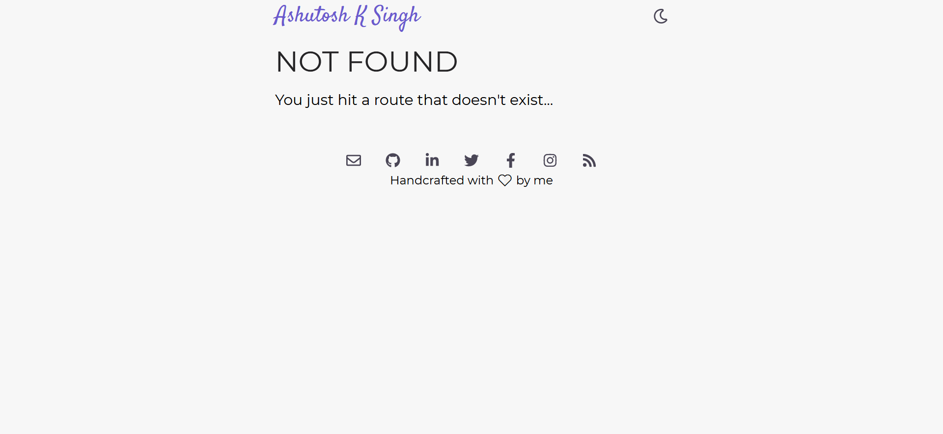
const NotFound = () => {
return (
<Container>
<SEO title="404 Not Found" />
<h1>NOT FOUND</h1>
<p>You just hit a route that doesn't exist...</p>
</Container>
);
};
export default NotFound;
The above code uses the Container component to create a 404 page with a simple text that this route doesn’t exist. Head over to http://localhost:8000/404/ to see your new 404 page in action.
Adding a Manifest to Your Gatsby Starter
A Progressive Web Application enhances user experience based on the browser capabilities, makes your website installable as an app on mobile devices, supports caching and offline usage. A PWA also adds support for push notifications and has access to multiple native APIs such as camera, geo location, payments, etc.
Gatsby’s manifest plugin configures Gatsby to create a manifest.webmanifest file on every site build. Run the following command to install the gatsby-plugin-manifest plugin.
npm install gatsby-plugin-manifest
Stop your development server and update the gatsby-config.js file to include the gatsby-plugin-manifest plugin like this.
Make sure to update the above fields with your blog data and color scheme. myAvatar.png is an image inside the src/images folder, so you can replace this with a photo of your choice.
Restart your development server by running the gatsby develop command in the terminal. Head over to http://localhost:8000/manifest.webmanifest where you will see a manifest file like this.
Now your Gatsby starter will function as a progressive web app, and users will be able to save it to their device’s home screen. You can also enable offline mode, push notifications, or any of the other features PWAs offer.
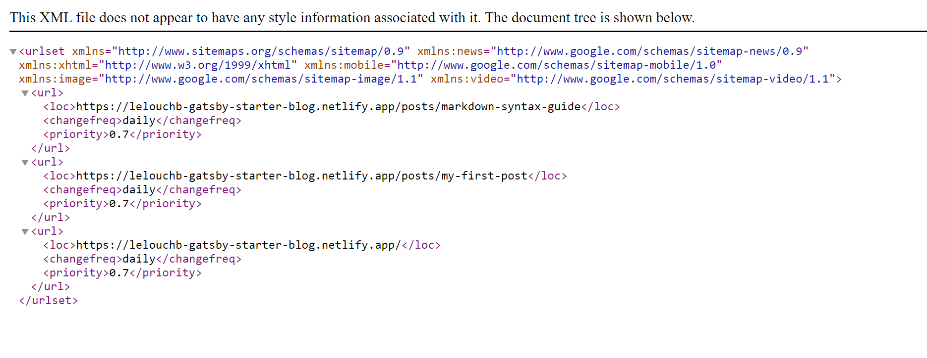
Adding a Sitemap
A sitemap is an XML file that lists a website’s essential pages, making sure search engines (such as Google) can find and crawl them all. In this section, I’ll show you how to add a sitemap to your Gatsby starter.
Stop your development server and install the gatsby-plugin-sitemap plugin by running the following command.
npm install gatsby-plugin-sitemap
Update gatsby-config.js to include this gatsby-plugin-sitemap plugin.
The above GraphQL query fetches all the metadata of your blog as well all the existing routes. If you run this query in the GraphiQL playground, you will see an output similar to this.
Let’s say that I am an avid reader of your blog and I want to be notified of every new article that you publish so one way would be to visit your blog everyday and manually check for new articles. This task is tedious even for one blog but what if I want to be notified of many blog websites, manually checking is out of the box.
This is where the RSS feed comes to save the day, readers can use a RSS feed reader like feedly, Miniflux, RSS Owl, etc. and subscribe to your RSS feeds and be updated with latest articles.
Here is an example of someone subscribing to this starter blog RSS feed.
Earlier in this tutorial, you added an RSS feed icon in the footer that points to the /rss.xml route that didn’t exist yet. To create the RSS feed, you will use the gatsby-plugin-feed plugin.
npm install gatsby-plugin-feed
Stop your development server and update the gatsby-config.js file to include the gatsby-plugin-feed plugin.
There are two GraphQL queries in the above code: one for the site metadata and the other for all the posts. Like gatsby-plugin-sitemap, you will need to create a production build to see this plugin in action.
Make sure to update the siteUrl in the gatsby-config.js file before deploying your blog so that the RSS feed’s URL is correct.
Finishing the Starter
At this point, you have created a working Gatsby blog, but you still have one more step to make it a shareable Gatsby starter. According to official Gatsby documentation, a starter should have a few specific files to work properly.
First, add a README.md to your project. This should contain a screenshot of the starter and a thorough explanation for users to configure and customize it.
Next, add a License to your project. BSD Zero Clause is generally preferred for Gatsby starters.
Finally, update the package.json file to include the license, description, author name, version, etc. You can see this starter’s package.jsonhere.
Now you can submit your starter to the official Gatsby registry or simply share your starter with other developers on GitHub.
Summary
In this tutorial, you learned how to build a Gatsby starter from scratch using MDX, Styled Components, and various Gatsby plugins. This starter included blog posts, an author bio, search engine optimization plugins, an RSS feed, and more. Using this starter, other developers will be able to build their own Gatsby projects much faster.
You can explore the source code of this project on GitHub, or if you want to use the starter created here, run the following in your terminal.
gatsby new my-gatsby-blog https://github.com/lelouchB/gatsby-starter-blog
If you’re inspired to add features yourself, please do share and tag me – I’d love to hear about them!
Lately, developers are adopting static site generators like Hugo to quickly deliver content to their audience. Frameworks like these cut down on issues that pop up with scalability, version control, managing dependencies, and performance.
Hugo in particular offers tons of features right out of the box for creating fast, modern, and secure static websites. It’s written in Go, a powerful server-side scripting language, and offers a clean workflow for creating landing pages, portfolios, documentation, or blogs without a lot of extra layers of complexity.
Hugo also has plenty of themes ready to go right away, but a prebuilt theme probably isn’t going to match your brand’s vision. Most likely, you’re going to want a custom theme, something that affords you fine-grained control over things like color schemes, typography, and UI components.
In this article, I’ll walk you through how to quickly customize your Hugo site for your desired brand and aesthetic by building your own theme.
How to Create a Multi-author Hugo Blog Theme
Specifically, I’ll demonstrate how to create a multi-author blog theme in Hugo. I’ll cover paginating multiple blog posts, adding tags or categories, setting up support for multiple authors, and adding some SEO considerations to give your site more presence on the web.
Spinning Up a Site
Once you have Hugo installed (refer to the complete installation guide here) and a modern code editor (like VS Code), you’re ready to begin.
In a directory of your choice, create a new Hugo site by running the following command:
{% raw %}
hugo new site multiauthor-blog-site
Once a new Hugo project is created for you, navigate into the directory.
cd multiauthor-blog-site
Open the project in your editor and run the following command to spin a development server where you can see your changes live:
hugo server
Creating a Theme
With your brand-new site up and running, it’s time to start customizing the canvas.
Create a new theme inside the root directory by running hugo new theme blog-theme. This generates a folder called blog-themes inside the themes directory containing a bunch of files and folders. You’ll mostly be working with two directories: /blog-theme/layout, where all your HTML files will be present, and /blog-theme/static for static assets like images, CSS styles, and custom JavaScript.
It’s time to tell Hugo that you’ll be using this new theme for your site. Usually, those details go inside a configurational file config.toml in the root directory. Add a key theme with a value of your theme’s name (ie, blog-theme) as shown:
baseURL = "http://example.org/"
languageCode = "en-us"
title = "My New Hugo Site"
theme = "blog-theme"
Inside the baseof.html file (theme/blog-theme/layouts/default/baseof.html), add the following markup:
The previous code creates some semantic elements for your site and references a site variable from your config.toml file in Hugo’s default templating language Go. If you look inside your /theme/blog-theme/layouts/partials folder, you’ll find a head.html file containing all the markup for your site’s <head> tag. Similarly, you can find a partial footer.html file to render a footer on your site.
The rest of the content of your site should go inside the <main> tags.
Add the following lines inside /theme/blog-theme/layouts/index.html to tell Hugo to insert the page content between the <main> tags in the baseof.html file:
{{ define "main" }}
{{ .Content }}
{{ end }}
Creating and Styling the Navbar
The navigation bar allows users to easily visit different sections of your site.
Inside /theme/blog-theme/layouts/partials, you can find a header.html that acts as the default header for your site. Put all the HTML for the navbar inside this file. Hugo will automatically render it on your site.
The / link is to direct the user to your site’s homepage. You can leave the remaining links as it is for the moment.
Your navbar could look better, so let’s walk through how to add custom CSS styling to your theme. The static folder inside your theme holds all the static content related to your theme, including custom styles for your templates. So all stylesheets pertaining to your theme go inside the /theme/blog-theme/static/css folder.
Create a file called style.css and reference it inside your theme’s head.html file (/blog-theme/layouts/partials/head.html) as shown:
Hugo will push all your styles from this file onto your HTML pages.
You can create multiple stylesheets to break down your styles into logical modules. For brevity’s sake, let’s keep all the styles for this project inside style.css only.
You can easily style other pages following the same pattern.
Adding, Organizing, and Listing Blogs
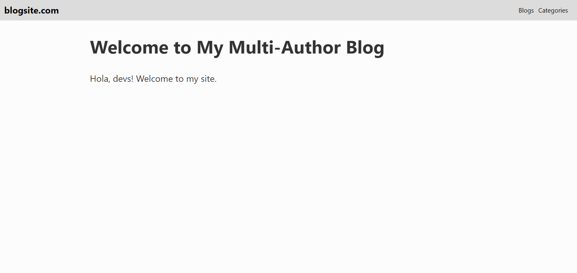
All the markdown files for your site go inside the content folder in the root directory of your project. Hugo renders the main content for your homepage from an _index.md file inside the content directory.
Create an _index.md as shown:
# Welcome to My Multi-Author Blog
Hola, devs! Welcome to my site.
Inside the content directory, create a blogs folder where you can organize your blog posts. You can segregate them further based on the year of publication. The following command creates a new blog post in the designated directory with some metadata:
hugo new /blog/2020/fundamentals-design-principles.md
Inside that file, add some dummy content:
---
title: "Fundamentals of Design Principles"
date: 2020-12-27T22:37:51+05:30
draft: true
---

### Diving deeper into design principles and methodologies
Lorem...
While you’re at it, add a few more blogs with some content using the same process:
hugo new /blog/2020/java-spring-mvc.md
hugo new /blog/2020/hugo-themes.md
Let’s create a page for your theme that lists all the blogs and allows a user to navigate to a particular post.
Recall that the navbar contains a route directing to /blogs, so you can render a list of all the blogs when the user visits /blogs. Hugo has a default directory where it looks for list type pages; this is where you can create a generic template for any kind of lists you want to render.
Inside /blog-theme/_default/list.html, add the following code, which simply iterates over the .Pages variable that contains a list of all child pages for /blogs. Inside the range loop, the current context (or the dot.) is always an individual page that’s used to generate the customized link.
Now, if you now go to http://localhost:1313/blog, you will see a list of all your blogs. Navigate to each blog by clicking an item on the list.
Creating a Blog Post Template
Next, let’s create a template for your theme that renders each new blog post exactly as you’d like it to appear.
Head over to the layouts folder (/theme/blog-theme/layouts) and create a folder named blogs with a file single.html inside it. This structure allows Hugo to render blogs faster, as it’s higher in the lookup order with respect to the single.html file present in the _default (/theme/blog-theme/layouts) directory.
The previous markup structures the contents of the blog post page by first rendering the blog’s title, followed by metadata like author name, image, an average read time, and related content categories.
Go to /blogs and click on a blog post to see some structured content of that post. Since other details, like author information, haven’t been hooked yet, you’ll only see some boilerplate text.
Add some hard-coded categories for your blogs inside the config.toml file:
You can now simply loop over these categories and render them inside the single.html.
Adding Support for Multiple Authors
Now your content is there, but there’s still no information about the author.
If you were building a single author template, you could create a variable for author name and image in the config.toml file and reference it inside the single.html file as you did for categories in the previous section. Since you want more than one author on your site, you need to add support for multiple authors in your theme.
Inside the root folder, head over to the data directory and create a JSON file with the name of the author (for example, siddhantvarma.json) with the following information in JSON format about the author:
{
    "name": "Siddhant Varma",
    "bio": "Howdy Guys! I'm a React and JavaScript Developer from India. I love watching             movies and creating content for developers",
    "avatar": "/img/authors/siddhantvarma.jpeg",
    "social": {
        "linkedin":"https://www.linkedin.com/in/siddhantvarma99/"
    }
}
Add more author information to your preference, like social media handles and external sites. You can use the following structure to organize your authors:
├── data
    └──authors
        └── siddhantvarma.json
        └── sammills.json
        └── randylev.json
Create as many authors as you like. Add an author key and value pair inside the metadata for each post as shown to associate an author with a particular blog post/ Yyou must ensure that the author’s name matches exactly the name of the JSON file for that author.
---
title: "Java Spring MVC"
date: 2020-12-27T20:08:49+05:30
author: randylev
---
Now each blog post is associated with a JSON file describing some details about that post’s author.
You can go back to single.html and render the author properties on the page along with the categories added in the previous section.
And there’s your blog with some content, metadata, an author image, and categories. You can easily navigate to other blog posts and see how various author information is rendered.
Implementing Pagination
Ensure good user experience on your site by allowing a user to easily paginate through the blog posts. Hugo offers this feature right out of the box by providing the variables .PrevInSection and .NextInSection. These link to the previous and next page objects to implement simple pagination for your theme.
The following code renders two buttons at the end of each post and directs the user to the immediate previous and next post with respect to the current post.
Now you have a set of fully functional pagination buttons at the end of each post.
Creating a Category Page
Categories are common on blogs for easy discovery of similar posts on your site. You already have some predefined categories inside config.toml file, so let’s create a separate category page that lists out all the categories and all the blogs associated with each one.
You need to associate blogs with your categories, so head to your markdown files and add some categories inside the metadata.
---
title: "How to create multi author blog site using Hugo"
date: 2019-03-20T18:42:38+02:00
description: "In this tutorial you're going to learn how to create a multi author blogging site in Hugo"
author: siddhantvarma
categories : ["Web Development","Web Design","Blogging"]
---
Hugo provides taxonomy, which classifies logical relationships between content. According to Hugo’s documentation, it offers default taxonomy support for categories and tags. This means you can easily set up a category taxonomy for your site.
Specify that you want to use the category taxonomy inside the config.toml file:
[taxonomies]
  category = "categories"
Inside your _default folder, create a file called taxonomy.html that ranges through the taxonomies, and then loops through each taxonomy to list out all the items pertaining to that taxonomy name. In this case, each taxonomy is a particular category, and blogs pertaining to each category are listed under that category as that taxonomy’s value.
Finally, your theme should be optimized for search engines to ensure your site draws users. Two factors in particular affect SEO for your site:
The SEO title
The meta description
Your homepage’s title can be populated from your config.toml file. For other pages, a unique title and meta description should be dynamically generated to make these pages easily discoverable by search engines.
Use the following generic code inside your head.html file:
<head>
    <meta charset="utf-8">
    <meta name="viewport" content="width=device-width, initial-scale=1, viewport-fit=cover">
    <title>{{ if not .IsHome }}{{ with .Title }}{{ . }} | {{ end }}{{ end }}{{ .Site.Title }}</title>
    <meta name="description" content="{{ with .Description }}{{ . }}{{ else }}{{ with .Summary }}{{ . }}{{ else }}{{ .Site.Params.description }}{{end }}{{ end }}">
    <link rel="canonical" href="{{ .Permalink }}" />
    <link rel="stylesheet" href="/css/style.css" type="text/css" media="all" />
    {{ template "_internal/opengraph.html" . }}
    {{ template "_internal/twitter_cards.html" . }}
</head>
The previous code checks whether you’re at a root route, then fetches the title from the config.toml file. For other subroutes, it uses a different title according to the page you’re currently on and appends the homepage title to it.
If you inspect each page’s <head> tag, you’ll notice a more specific and relevant title attached to it with an SEO-friendly meta description.
{% endraw %}
Next Steps
Use the theme you built here as a boilerplate for your own multi-author blog. Customize it even further according to the needs of your brand—extend taxonomies by adding tags and maybe create promotional pages, like an about page or a contact page. Now that you also understand how custom styling works in Hugo, add some media queries to make your site more responsive.
Hugo’s functionality simplifies the potentially daunting task of creating a custom theme, while offering you fine-grained control over your branding and the flexibility to accommodate change in the future.
There are a few key factors that will influence your choice of a blogging platform. While I could devote an article to each of these, I’ll save that for another day, and just leave you with a brief summary.
Here are the five things I consider when choosing a blogging platform:
Cost to set up and maintain
Ease of use
Customizability
Distribution
Speed and scalability
You should weigh each of these factors based on your needs and the team who will be managing the blog.
Startup Blogging Platforms
Setting up a blog doesn’t have to be a headache – there are many platforms out there that will help you build a professional-looking one. Below I’ve collected a few of the best options for your startup’s blog in 2021.
Squarespace ($12) – Squarespace is my go-to recommendation for non-technical people who need a website. Squarespace works just as well for basic landing pages as it does for a full-featured website and blog.
GraphCMS ($0) – Brings your content to any platform or static site builder. With GraphCMS, you build the essential GraphQL infrastructure and they build a headless CMS for your content creators.
Jekyll ($0) – If you don’t mind writing a little HTML yourself, Jekyll is an awesome landing page and blogging platform. It can scale pretty much infinitely and it’s free to use with Github pages. You can also read our comparison with WordPress and our comparison with Hugo.
Gatsby ($0) – The new, hot static site builder has a great reputation among developers, and they’re growing quickly. If your tech team uses React, you might want to consider Gatsby.
Linkedin Publishing ($0) – Linkedin has a publishing tool that allows anyone to write blog posts that are immediately shared with their Linkedin network and profile. You don’t get any options for customizing your posts or calls to action, but it’s simple and gets automatic distribution.
ButterCMS ($24) – If you’d prefer to use a CMS as a backend and integrate your blog into your site, an option like ButterCMS would work. This works best with a static site builder or single-page application.
Cockpit ($0) – Cockpit is perfect if you need a flexible content structure but don’t want to be limited in how to use the content. You can use Cockpit for much more than blogging if you like.
Contentful ($0) – Like ButterCMS, Contentful can be used as a complete content management system with an API that will hook into your site. Both solutions are only recommended for developers.
Drupal ($0) – Free, open-source, and built on PHP, Drupal is a full-fledged content management system with a huge community. It’s more flexible than WordPress in many ways, but also requires more work to customize.
Ghost ($0) – An open-source NodeJS blogging platform, Ghost can be installed on your server or you can use Ghost Pro to let them serve it up. In either case, Ghost provides a nice-looking theme and great options for customizing your blog.
Medium ($0) – Medium has become really popular for startup blogs. While you don’t get to customize the look of your blog, it gets some free distribution on Medium.com.
Postach.io ($9) – Allows you to use Evernote as your blog’s backend.
Postagon ($0) – Many of the blogging platforms on this list have more features than Postagon, but if you like a clean, minimal experience, you can start writing on Postagon in less than a minute.
Stitcher ($0) – A PHP-based static site generator. Offers the speed and flexibility of pure HTML for developers who might prefer PHP.
Tumblr ($0) – Tumblr is simple and customizable, plus you can make it work with your own subdomain. The community features also give you some built-in distribution although it’s less popular than Medium today.
Weebly ($0) – Weebly is a great all-in-one website and blog creator with many templates and tools to choose from.
Wix ($0) – Wix gives you everything you need for a stunning website or blog and it’s free.
WordPress.com ($0) – WordPress.com is a hosted blogging service. It makes setup easier, but allows for less flexibility and includes fewer plugin options than WordPress.org.
WordPress.org ($0) – While you’ll have to install WordPress on your own server, hosting is usually cheap. The biggest downside to WordPress now is the spam that shows up because it’s so popular.
Write.as ($0) – Quick, free (or cheap to upgrade), does custom domains, custom CSS, and it’s easy to create a bunch of blogs from one account if you upgrade.
Need help generating high-quality content for your startup’s blog? Check out Draft.dev and let us know if we can help.


